
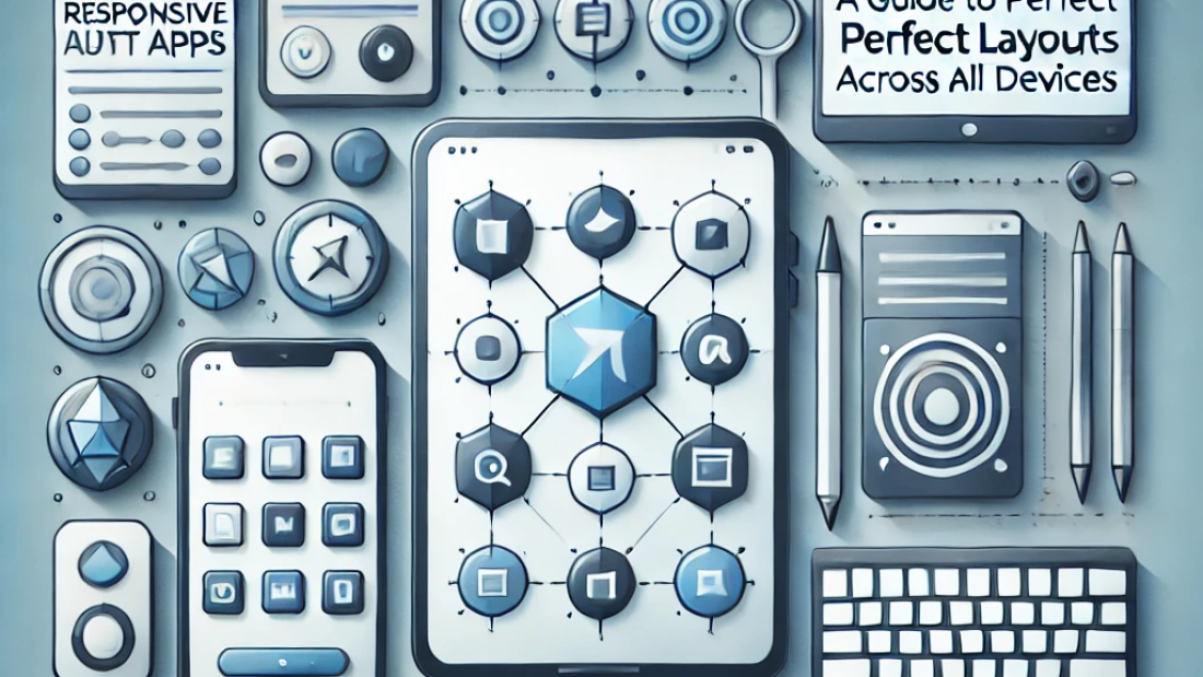
Building Responsive Flutter Apps: A Guide to Perfect Layouts Across All Devices
ntroduction:
Creating responsive designs is crucial in today’s multi-device world. Flutter offers powerful tools to ensure your app looks great on any screen, from small smartphones to large tablets. This guide covers the key techniques and widgets for building adaptable, responsive layouts, including MediaQuery, LayoutBuilder, and Flex widgets, empowering you to deliver a consistent user experience across all platforms.
1. Understanding Responsive Design in Flutter
Start by understanding the importance of responsiveness and the basics of Flutter’s responsive layout tools:
- What makes a design responsive and why it matters for user experience.
- Pixel density and screen dimensions – Adapting your app to different screen sizes and pixel densities.
2. Using MediaQuery for Screen Dimensions
MediaQuery is essential for retrieving device information:
- Accessing screen height and width to adjust elements dynamically.
- Setting font sizes, padding, and margins based on screen dimensions.
- Example usage for adjusting UI elements like buttons and containers according to screen size.
3. LayoutBuilder for Adaptive Layouts
LayoutBuilder provides a more flexible approach to responsive design:
- Using constraints to determine available space and adjust layouts dynamically.
- Creating breakpoints for tablets, phones, and desktops to display custom layouts for each.
- Optimizing widget arrangements based on available screen space.
4. Implementing Flex Widgets: Row, Column, and Expanded
Flutter’s Flex widgets make it easy to create scalable layouts:
- Using Row and Column widgets for arranging elements horizontally and vertically.
- Implementing Expanded and Flexible widgets to handle flexible space distribution.
- Combining Flex widgets with LayoutBuilder for maximum adaptability.
5. Leveraging Responsive Packages
Several packages simplify responsive design in Flutter:
- flutter_screenutil – A popular package for managing screen size scaling.
- responsive_framework – Easily add breakpoints and flexible layouts with pre-configured settings.
- MediaQuery vs. package-based approaches – Understanding when to use native tools versus external packages.
6. Testing and Debugging Responsive Layouts
Testing across devices is essential for consistency:
- Using Flutter DevTools and simulators to test various screen sizes and orientations.
- Responsive design checklists for ensuring UI consistency.
- Common pitfalls in responsive design and how to avoid them.
Conclusion:
Building responsive apps in Flutter enhances usability and expands your app’s reach to a wider audience. By combining MediaQuery, LayoutBuilder, Flex widgets, and responsive packages, you can create adaptable layouts that look polished on any device. This guide equips you with the techniques and best practices needed to build Flutter apps that maintain a consistent experience across all screen sizes.